Visitors can enjoy a work while still feeling they are missing the artist's intent, technique, or cultural context. Finding that information usually means reading a dense label or leaving the gallery experience to search online.
CASE STUDY / 02FIVE-DAY DESIGN SPRINT
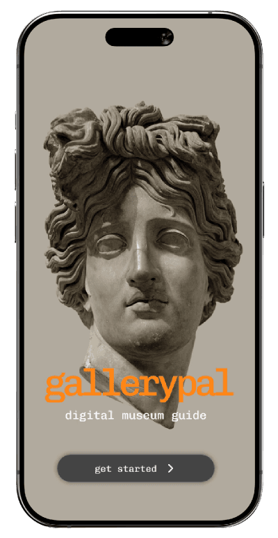
GALLERYPAL
A museum guide for people who want the story—not a lecture.
GalleryPal lets visitors recognize an artwork and choose the kind of context they want, without stepping out of the gallery moment.
01
The challengeContext without interruption
The artwork is right there. The meaning can still feel out of reach.
Museum visitors often want more than a title and date, but traditional labels, tours, and web searches can overwhelm the moment instead of opening it up.
The solution had to be useful in seconds, work while standing in front of the art, and give control back to the visitor rather than becoming another guided tour.
HOW MIGHT WEHelp museum visitors understand and connect with art—without disrupting the visit?
Useful in a crowded gallery and readable at a glance.
Let curiosity choose the depth and type of content.
Keep attention anchored to the physical artwork.
02
UnderstandResearch inside the museum context
Visitors didn’t ask for more information. They asked for a better way into it.
Interview and survey synthesis, including a conversation with an experienced museum educator, revealed that the best guide is concise, optional, and aware of the space around it.
RESEARCH INPUTS
- Visitor interviews
- Museum educator interview
- Survey synthesis
- Jobs to be Done
- Empathy mapping
Context creates connection
A short story or surprising detail can turn a passing glance into a memorable encounter.
The phone cannot become the exhibit
Information has to be brief, legible, and easy to leave so attention returns to the artwork.
Curiosity is personal
Some visitors want technique. Others want intent, history, or one useful fact. The interface must let them choose.
Pacing belongs to the visitor
A self-guided experience should support the museum visit without imposing the structure of a formal tour.
DESIGN THESIS
Give people one clear doorway into the artwork, then let them decide how far to go.
03
IdeateFive days, one critical moment
I treated recognition as the product—not just a feature.
The sprint centered on the second an artwork is detected. If that transition felt slow, confusing, or too dense, nothing after it would matter.
Map
Frame the problem and identify the in-gallery moment with the most value.
Sketch
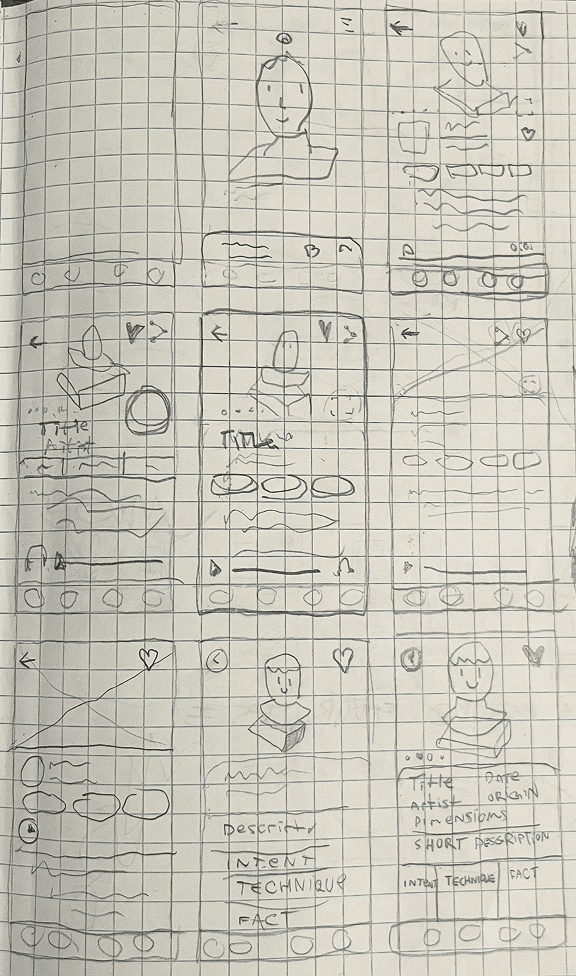
Study adjacent products, run Crazy 8s, and explore the recognition screen.
Decide
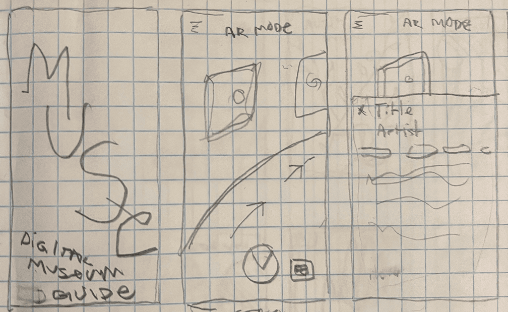
Choose the AR overlay concept and storyboard the full interaction.
Prototype
Build a realistic scan-to-insight journey for testing.
Test
Observe where the experience connects—and where the concept needs to grow.
ARTIFACT / 01Crazy 8s
ARTIFACT / 02Solution sketch
04
StructureFrom map to moment
One clear arc: notice, scan, choose, keep.
The storyboard turned a broad museum-guide concept into a small, testable path with one decision at a time.
01Explore
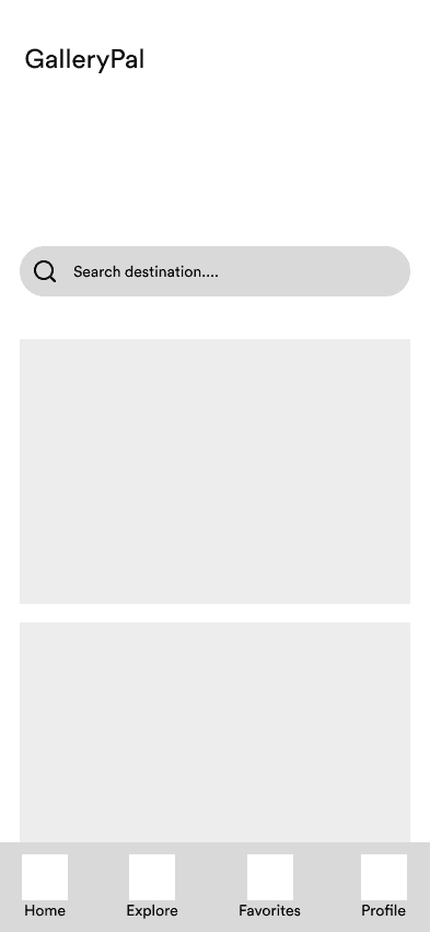
02Museum home
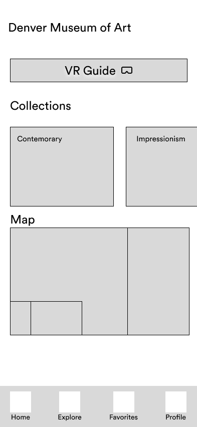
03Recognize
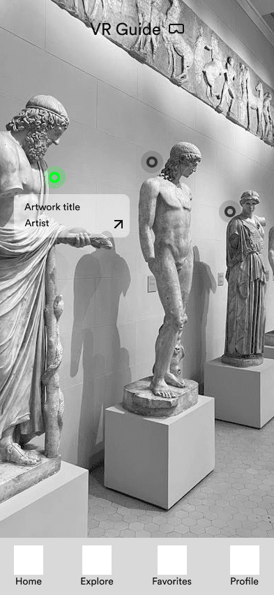
04Understand
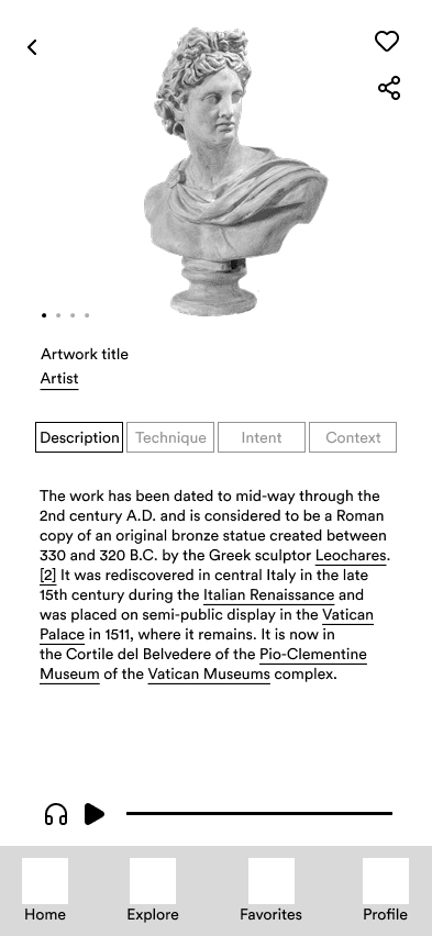
05Share
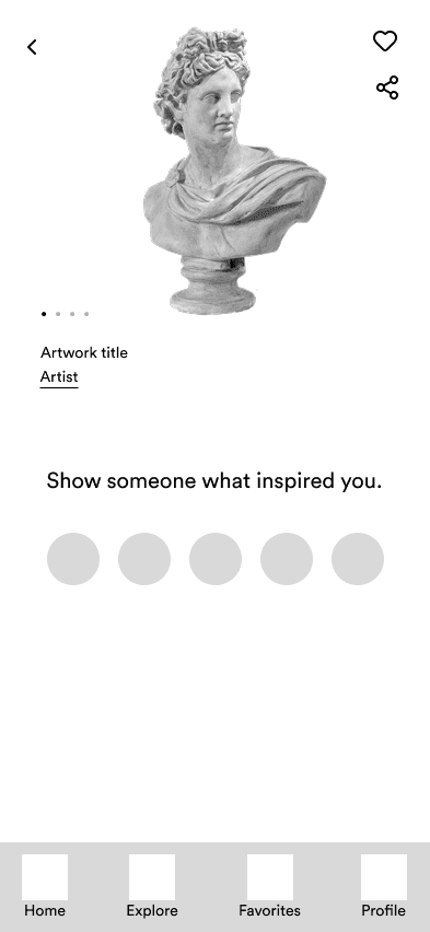
05
PrototypeThe in-gallery experience
The interface stays quiet until the artwork has something to say.
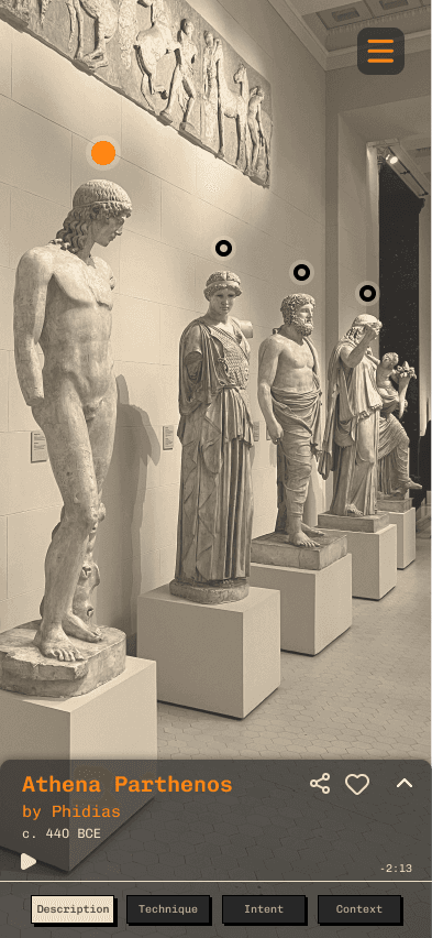
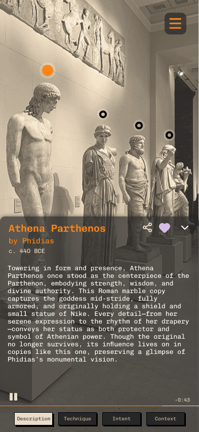
The prototype uses the camera as the canvas, reveals information progressively, and keeps audio, save, and share within reach.
Minimal framing keeps the camera focused on the room—not the interface.
Insight tabs let the visitor decide whether they want story, technique, intent, or context.
Save and share extend the encounter without cluttering the viewing moment.
01Welcome
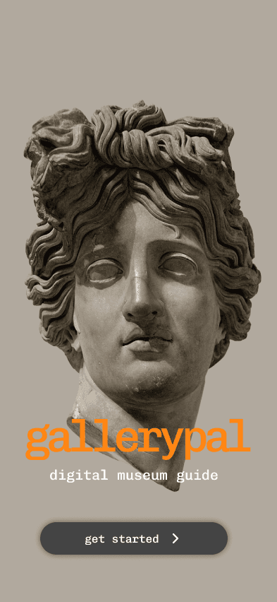
02Scan
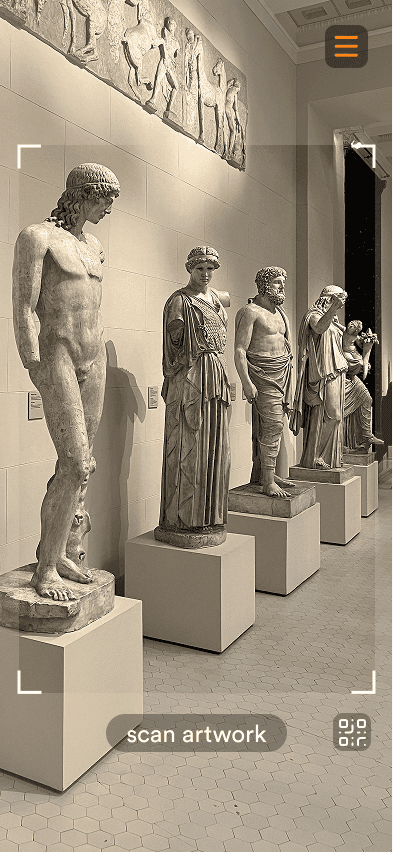
03Detect
04Insights
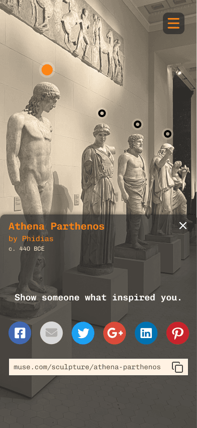
05Share
06
Test + learnThree participants, one important pivot
The core interaction worked. The product boundary didn’t.
Think-aloud testing validated the scan-to-insight experience while exposing a need the original sprint had not designed for: accessing art away from the artwork.
Scan-to-insight felt immediate
All three participants responded positively to recognizing a work and receiving context in place.
Tabs made depth optional
Participants understood the content categories and liked choosing between description, technique, intent, and context.
The experience needed a Browse mode
Two participants wanted to revisit artworks later or preview the collection without standing in front of a piece.
NEXT PRODUCT MOVE
The next version isn’t “more AR.” It’s more choice.
A Browse mode would let visitors preview the collection, revisit a favorite after leaving the gallery, and use GalleryPal even when scanning is not practical.
07
ReflectionWhat the sprint clarified
Designing for a place means designing around attention.
GalleryPal reinforced that the interface is only one part of the experience. Lighting, crowds, accessibility preferences, and the emotional pull of the artwork all shape what “simple” really means.
FIVE DAYS / ONE FOCUSED BET
A small amount of the right context can make an artwork feel much closer.