“Which bike is actually right for me?”
Specifications lived on separate pages, important differences were hard to retain, and too much detail made narrowing a choice harder.
Designing confidence into a high-consideration purchase.
A mobile bike-shopping experience that makes comparison easier, keeps checkout moving, and places reassurance where commitment feels highest.
See the decisions ↓
High-ticket e-commerce creates two connected problems: shoppers need enough information to choose well, then enough confidence to complete the transaction. Solving only the checkout would leave the harder decision untouched.
Specifications lived on separate pages, important differences were hard to retain, and too much detail made narrowing a choice harder.
Account gates, weak delivery context, and invisible reassurance gave shoppers more reasons to leave at the most valuable point in the flow.
I focused on the critical path from browsing through confirmation. The concept was evaluated as a prototype; the goal was to validate comprehension and confidence, not claim production conversion impact.
I combined secondary research with walkthroughs of Trek, Amazon, and Target. The audit compared product discovery, comparison support, account requirements, checkout progression, and trust signals.
Closest product context. Useful technical depth, but a high volume of specifications increases the need for hierarchy.
PRODUCT EXPERTISEFamiliar, compressed checkout patterns reduce interpretation even when the underlying transaction is complex.
CHECKOUT FAMILIARITYClear fulfillment and payment hierarchy shows how logistical information can reassure before commitment.
FULFILLMENT CLARITY
Alex represents a high-intent shopper who will invest in the right bike, but needs a fast way to compare meaningful differences and enough reassurance to purchase online.
Three patterns became design decisions. Each one connects an observed friction point to a specific product response.
Shoppers bounced between product pages and tried to remember meaningful differences.
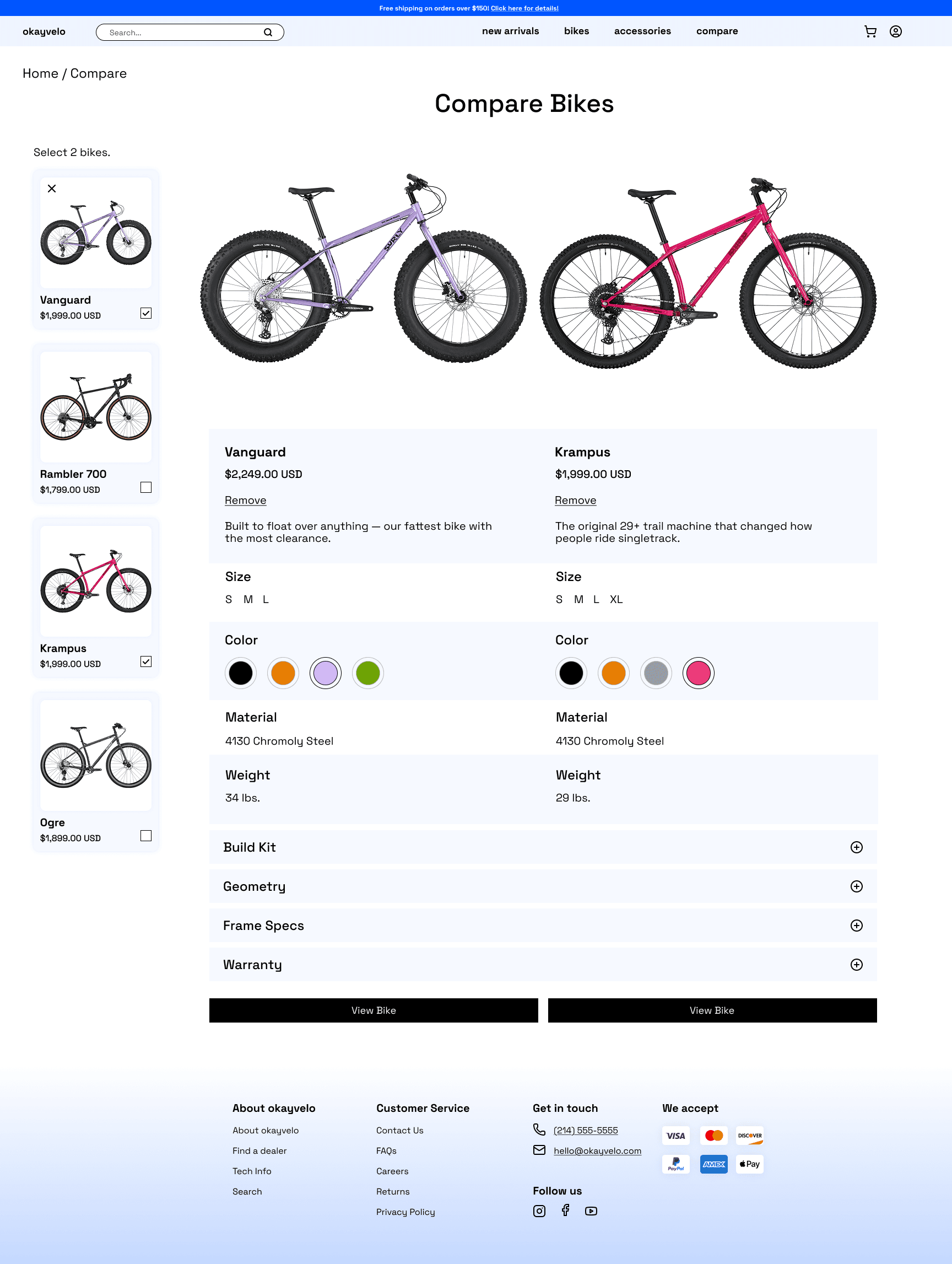
Create one side-by-side view and cap it at two bikes so the decision stays readable on mobile.
Mandatory account creation added a new decision at the exact moment shoppers were ready to pay.
Lead with guest checkout and make account creation an optional benefit—not a gate.
Security, warranty, and delivery information only helped when it appeared near the decision it supported.
Place reassurance inside comparison, cart, payment, and confirmation—not in a distant policy page.
Low-fidelity wireframes mapped one continuous path from discovery to purchase. This made it possible to challenge the information order, comparison model, and checkout sequence before visual design raised the cost of change.


Space Grotesk, a focused blue spectrum, direct labeling, and consistent controls give Okay Velo a precise identity while preserving the predictability people rely on in commerce.
Clear geometry supports dense product information without making the interface feel clinical.
#0055FF carries action and system status. Black, white, and blue tints keep the rest of the hierarchy quiet.
Strong CTA contrast and stable placement reduce the need to re-learn each step.
I ran two rounds of prototype testing. Round one identified breakdowns in comparison state, specification density, and the visibility of reassurance. I revised those moments, then used a five-participant second round to check whether the changes held.
People expected selected bikes to appear immediately.
Made compare status visible and turned selection into a clear, persistent system state.
The first specification table felt dense and encouraged skimming.
Reduced simultaneous detail, strengthened category hierarchy, and kept the comparison to two bikes.
Existing trust cues were overlooked during the first checkout test.
Moved security and delivery reassurance closer to payment and made the guest path unmistakable.
participants completed guest checkout without assistance.
The revised compare flow worked as expected, and trust cues were noticed earlier in checkout.Qualitative prototype finding — not a production conversion metric
The final prototype supports the full decision arc: discover an option, narrow the field, compare two bikes, check out as a guest, and leave with a clear confirmation.
A deliberate limit keeps differences legible on a small screen.
Purchase intent is not interrupted by an account requirement.
Security and delivery details appear beside the decisions they support.




Okay Velo taught me that established commerce patterns rarely need reinvention. They need sharper prioritization, better timing, and clearer relationships between information and action.
Connect the prototype to representative product data, test specification comprehension across rider experience levels, and validate delivery expectations with realistic edge cases.
In production, I would track compare usage, checkout entry, guest completion, field errors, abandonment by step, and post-purchase support questions.
Prototype testing supports the clarity of the revised flow. It does not establish revenue or conversion lift, which would require live behavioral data.